CELEBRATING EVERYDAY
LITTLE WINS.
THREE
ROBINS
VISUAL IDENTITY, PACKAGING, BRAND WORLD
making it easy for families to feel good about what they bring to the table.
Three Robins approached us with a strong family brand, and a desire to push innovatively into a space which tackled an age-old battle between parents and children over treats. For this, they needed a brand refresh, and to consolidate their essence into a new brand world.
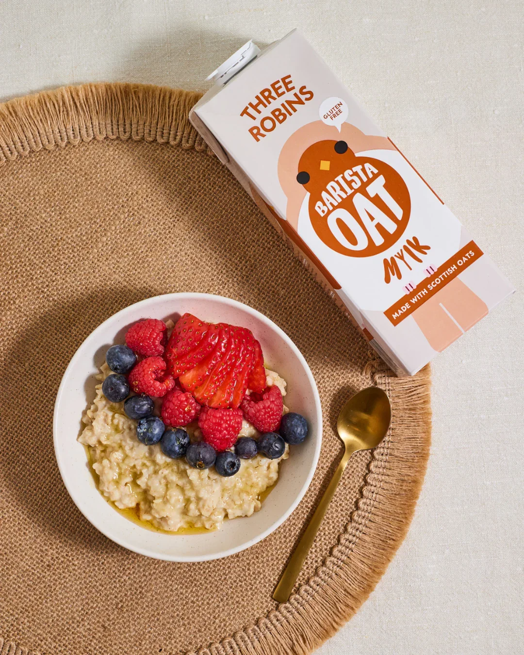
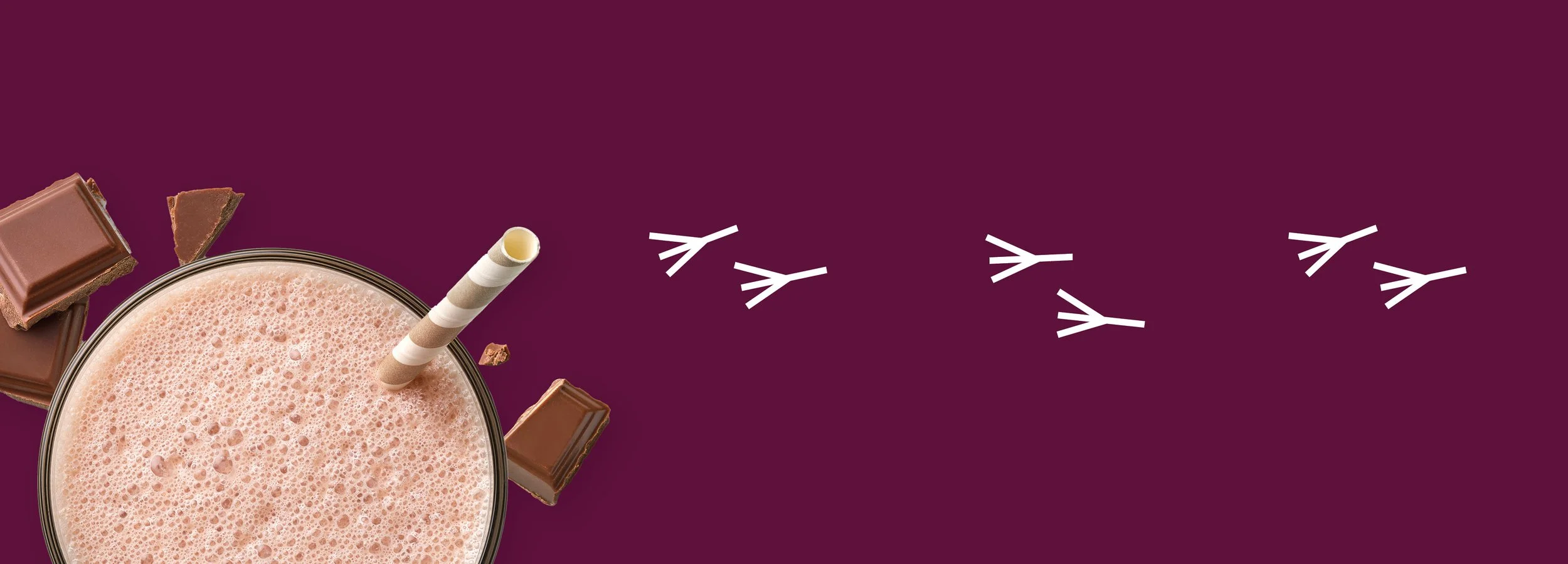
Our approach was to celebrate the good that parents do with a playful and fun brand, communicating that dietary or health switches needn’t be joyless. The end result? A brand which champions taste appeal, pleasure and joy with a brand that feels as honestly delicious as its products.

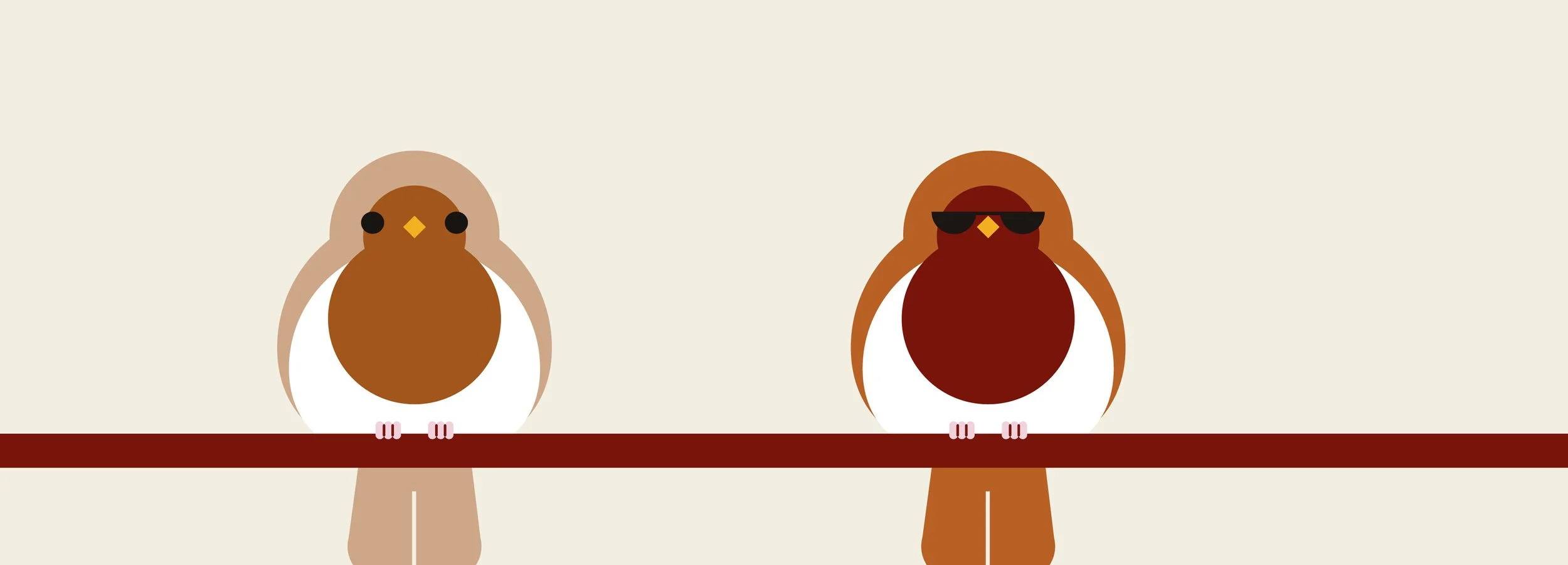
We championed the Three Robins brand proudly and with a brave, adventurous personality.
THE STRATEGY
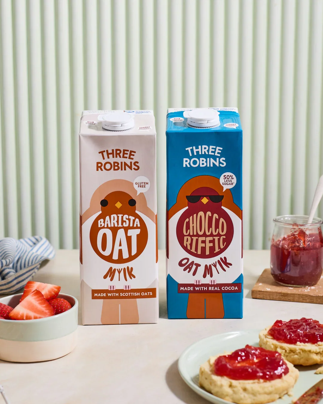
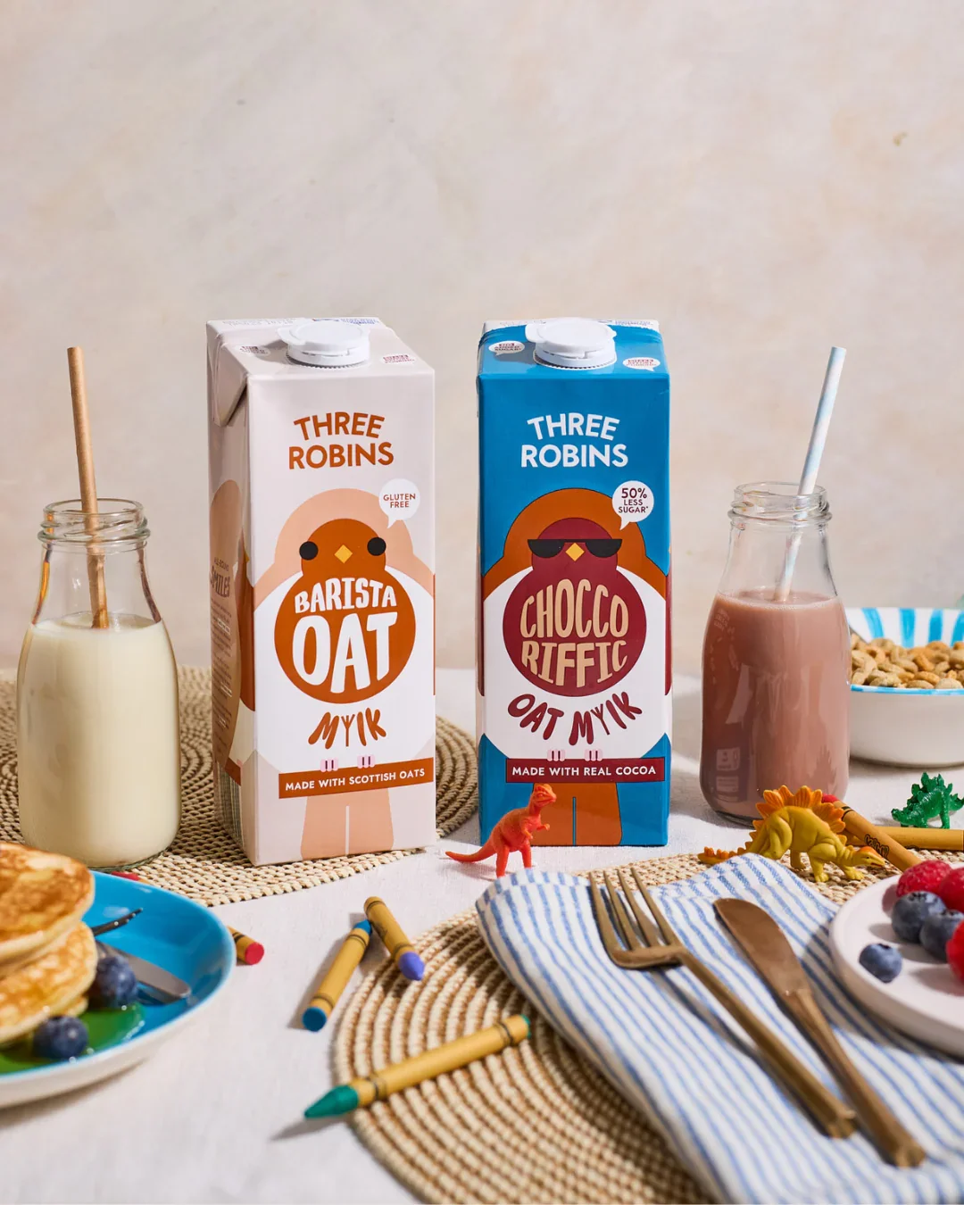
With a broadly expanding range of products, from barista oat to chocolate flavour, we believed that bringing the robin character to the fore was the clearest way of shouting personality across the aisle. The design, whilst bold and minimalist in its execution, has the power to satisfy the whole family – something that we knew was key in a household of busy adults and littles!
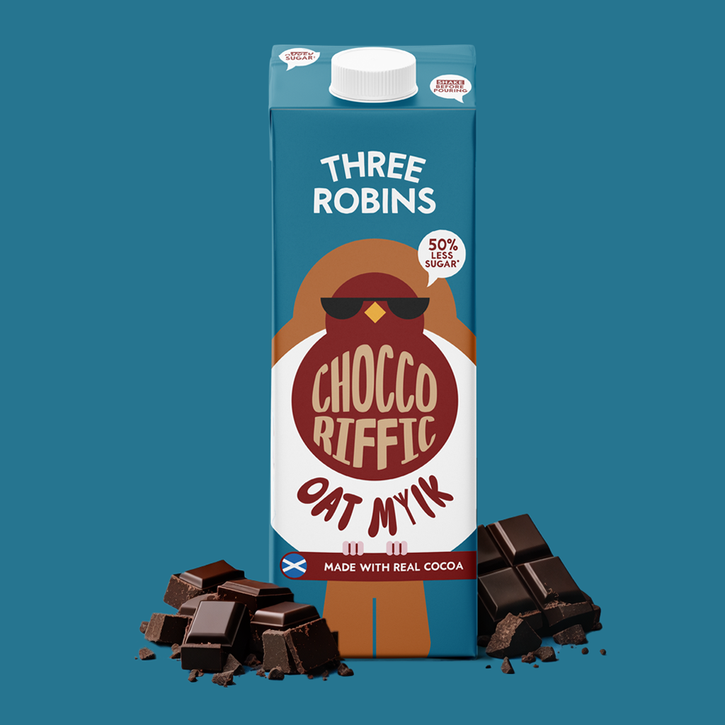
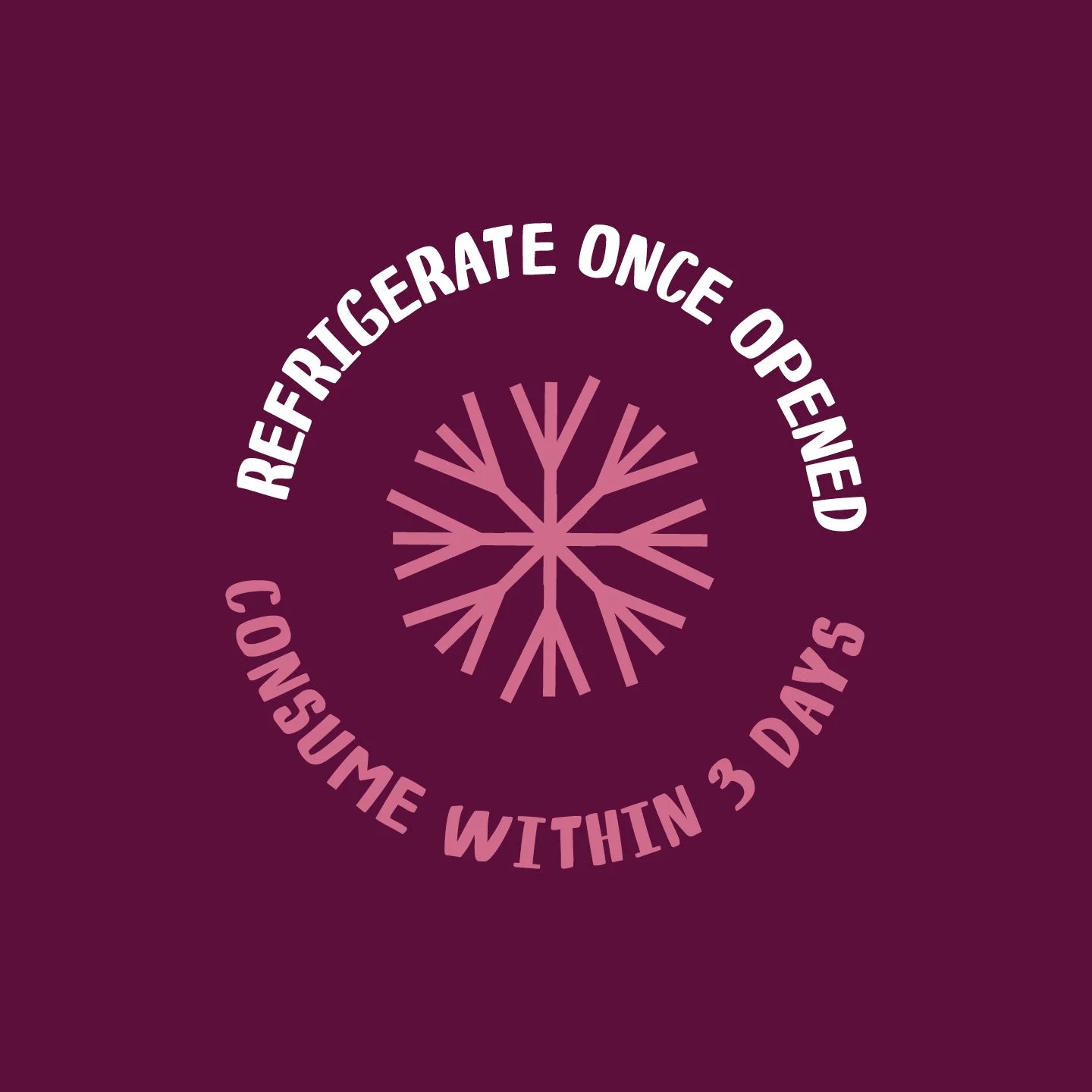
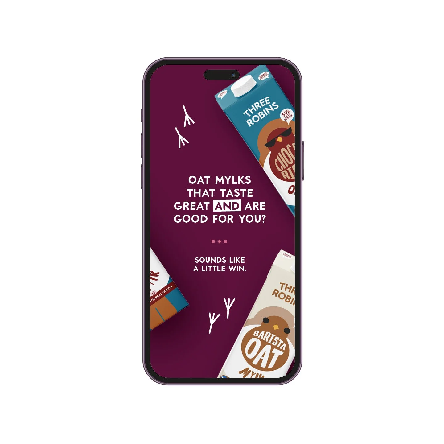
As with all projects, clarity of messaging is key. We took time to understand the importance of on-pack expression, and to listen to what our busy parent shoppers were looking for. With this in mind, all USPs are visually clear and uncluttered. Another “little win” in the supermarket run.