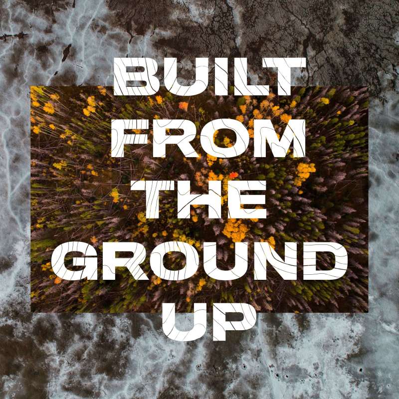
Roam : Built from the ground up
Project Overview
Cluttered market → Cut through, high-performance food


Our Approach.
Brand narrative
Roam wanted to challenge the status quo right from the start, cutting straight to the chase and offering a high protein snack bar that does exactly what it sets out to do. We helped them to shape a brand narrative that combines lifestyle and performance.
Brand identity
We created a simple, but bold, type-based logo for Roam, to reflect the brand’s confidence and powerful message. We crafted a transparent, straight-talking tone of voice to help us do the talking.


Packaging
We intentionally kept the design of Roam’s product packaging clean, using a minimal palette to clearly convey the information that would be most important to our audience, such as carbs and protein, the ingredient’s origin and other nutritional information.
Digital platforms
Roam’s ‘tell it like it it’ approach extended to their digital platforms. We worked with the founders to create a solid e-commerce website which streamlines the shopping process and makes it easy for consumers to make repeat orders, to save time.


Results
Since launching, Roam are making real food more accessible with a cut-through brand that has quickly garnered popularity.

Creative Director
To find out more about this project and to discuss how a similar solution may work for your brand, get in touch.