SNACKS, JUST A BIT WEIRDER.
NOMKINS
Strategy
Brand Positioning
Naming
Visual Identity
Packaging
Design
Tone of Voice
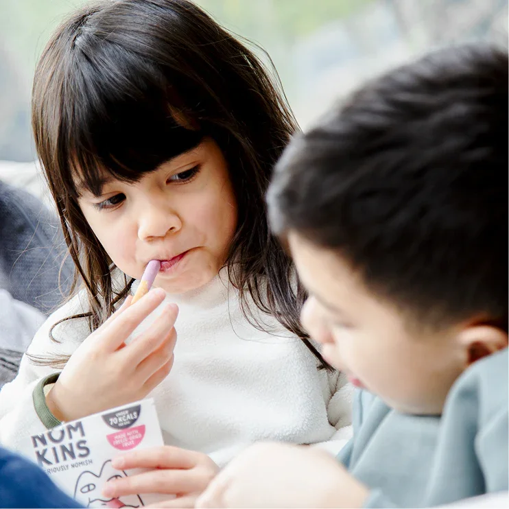
Nomkins was created to answer a growing tension in family snacking. Parents wanted products that felt natural and trustworthy, but still stood a chance in the playground. The market was crowded with snacks that leaned too heavily into either health or indulgence, leaving a clear HFSS white space for something more balanced. The ambition? To create a brand that could genuinely bridge that gap.
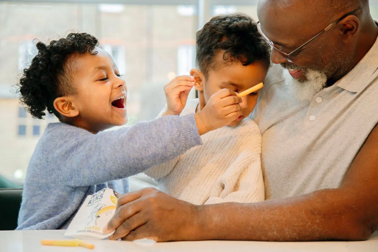
A snack that felt exciting to children, reassuring to parents, and naturally part of everyday family life.
We partnered with Nomkins to build the strategy, positioning and visual identity from the ground up. The result is a brand rooted in the wonderfully weird bond between kids and grown-ups, wrapped up in a world that feels playful, familiar and just a little bit odd.


Nom. It sounds like eating. Because that’s what it’s for. Easy to say. Easier to snack. Kind of addictive. Like the breadsticks.

Kins. It’s like family, but crunchier. The kind of snack that feels close. Familiar, shareable, maybe even lovable. Small, cute, probably gone in under a minute. Like all good things.


We identified a key emotional truth at the heart of modern family snacking: people aren’t just buying snacks for nutrition or convenience. They are buying small moments of reassurance, peacekeeping and joy.
Parents wanted snacks that avoided playground friction. Grandparents wanted to treat without guilt. Kids simply wanted something fun. So we positioned Nomkins around connection. A brand for modern families. A snack designed to fit naturally into real routines.
strategy
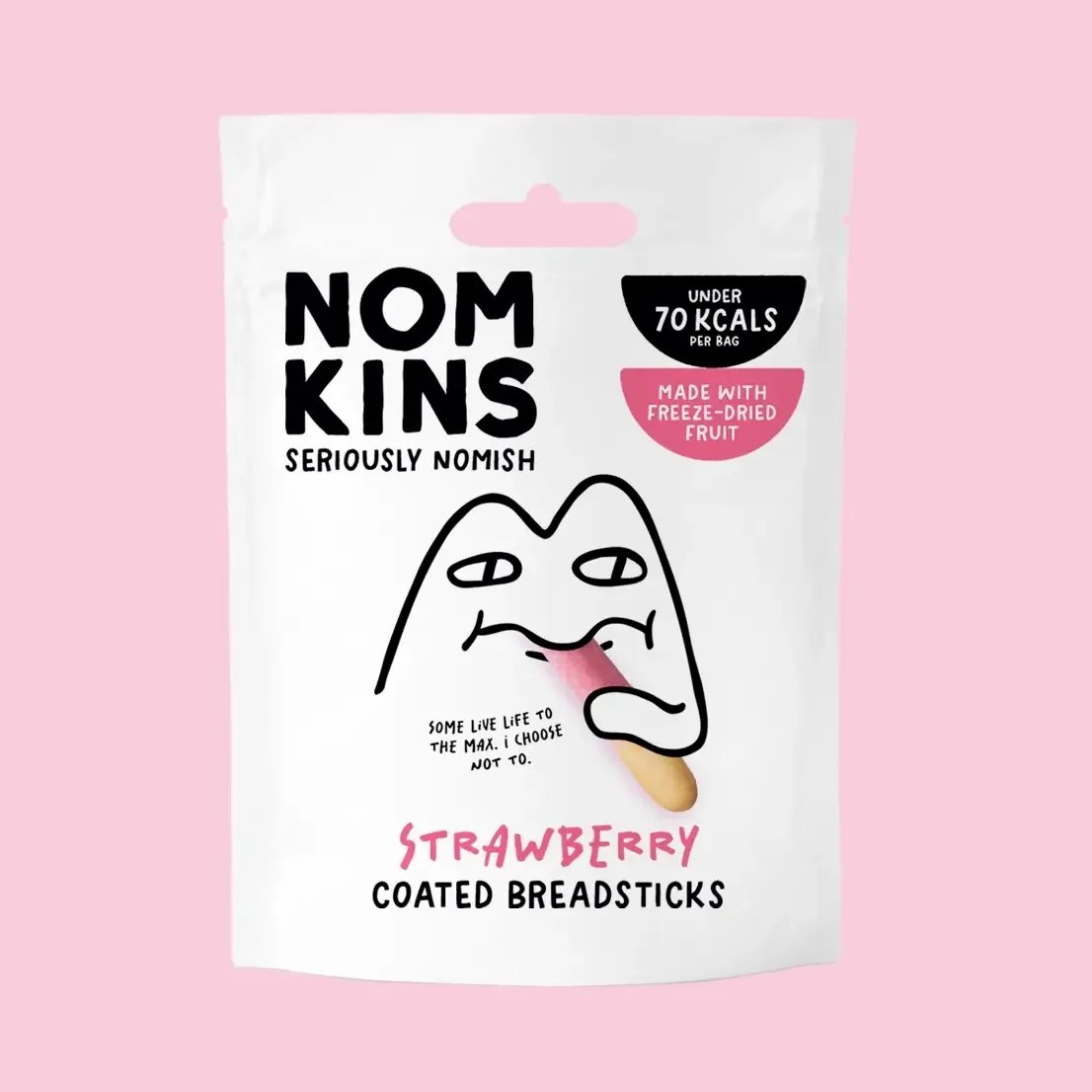
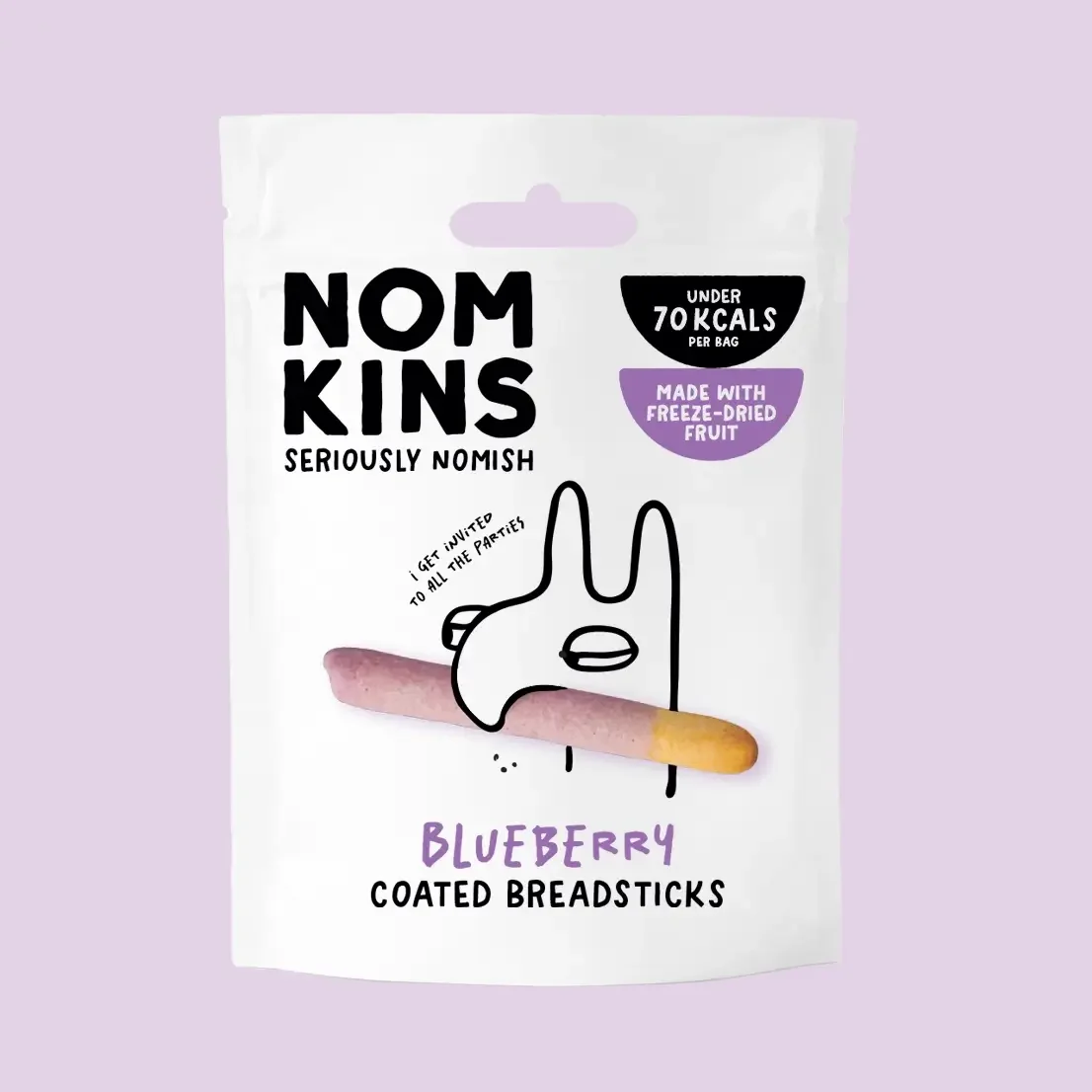
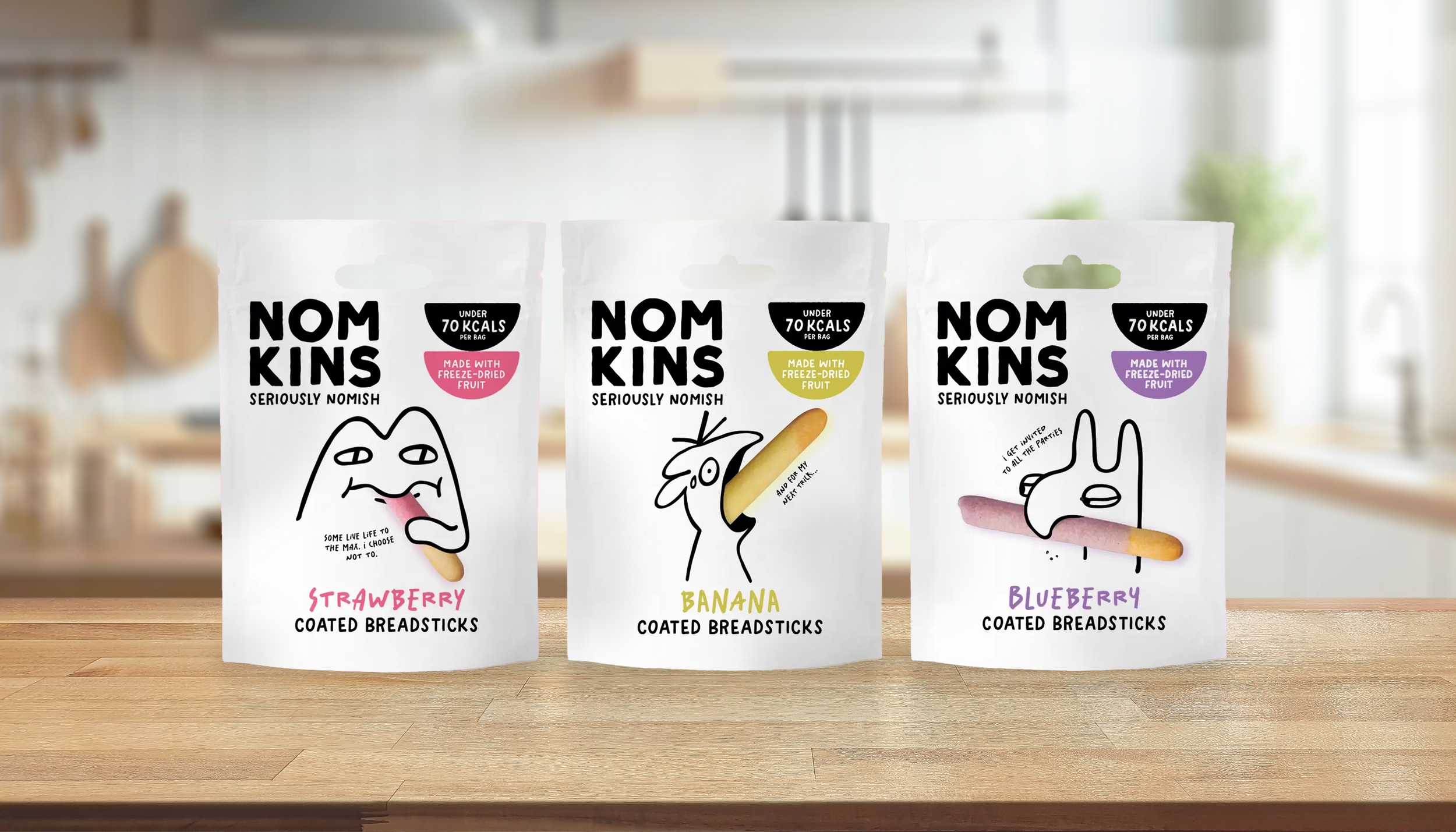
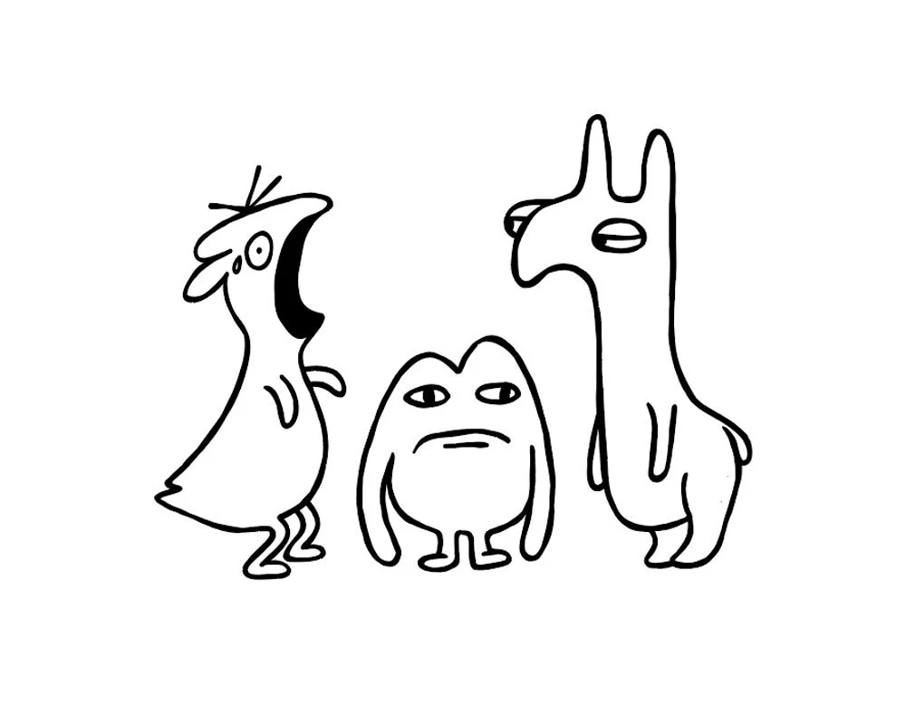
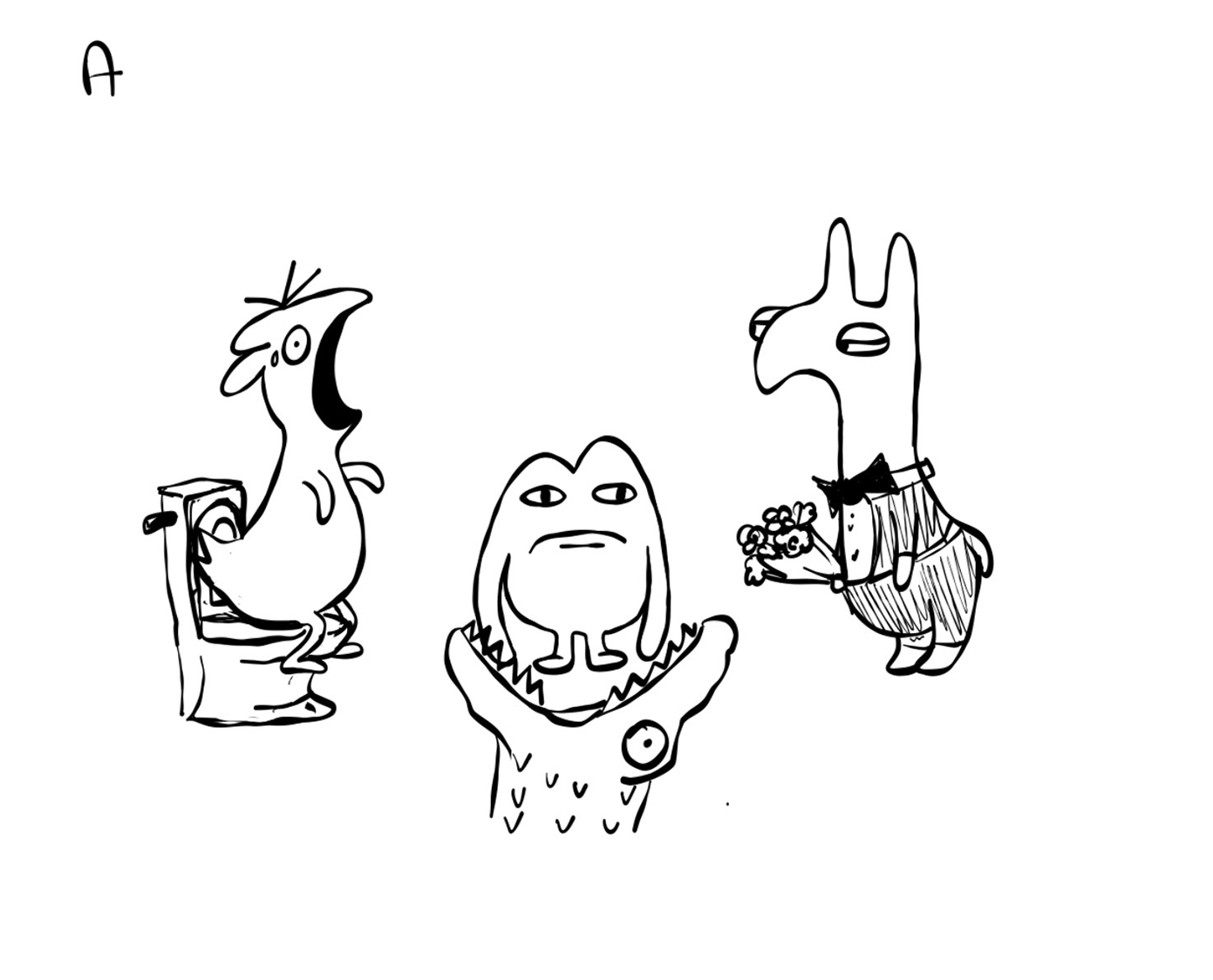
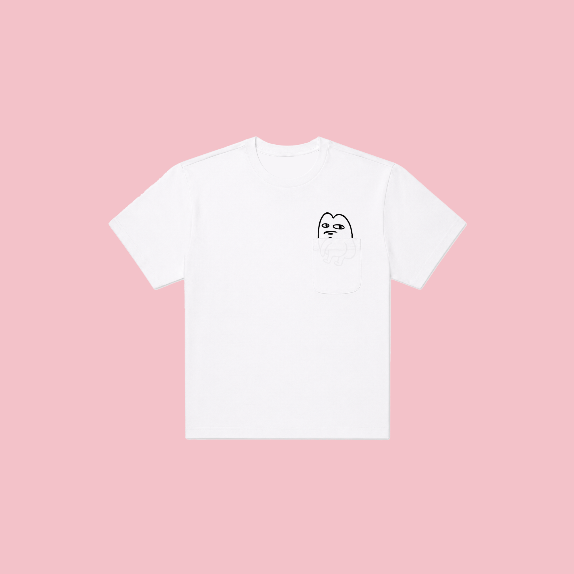
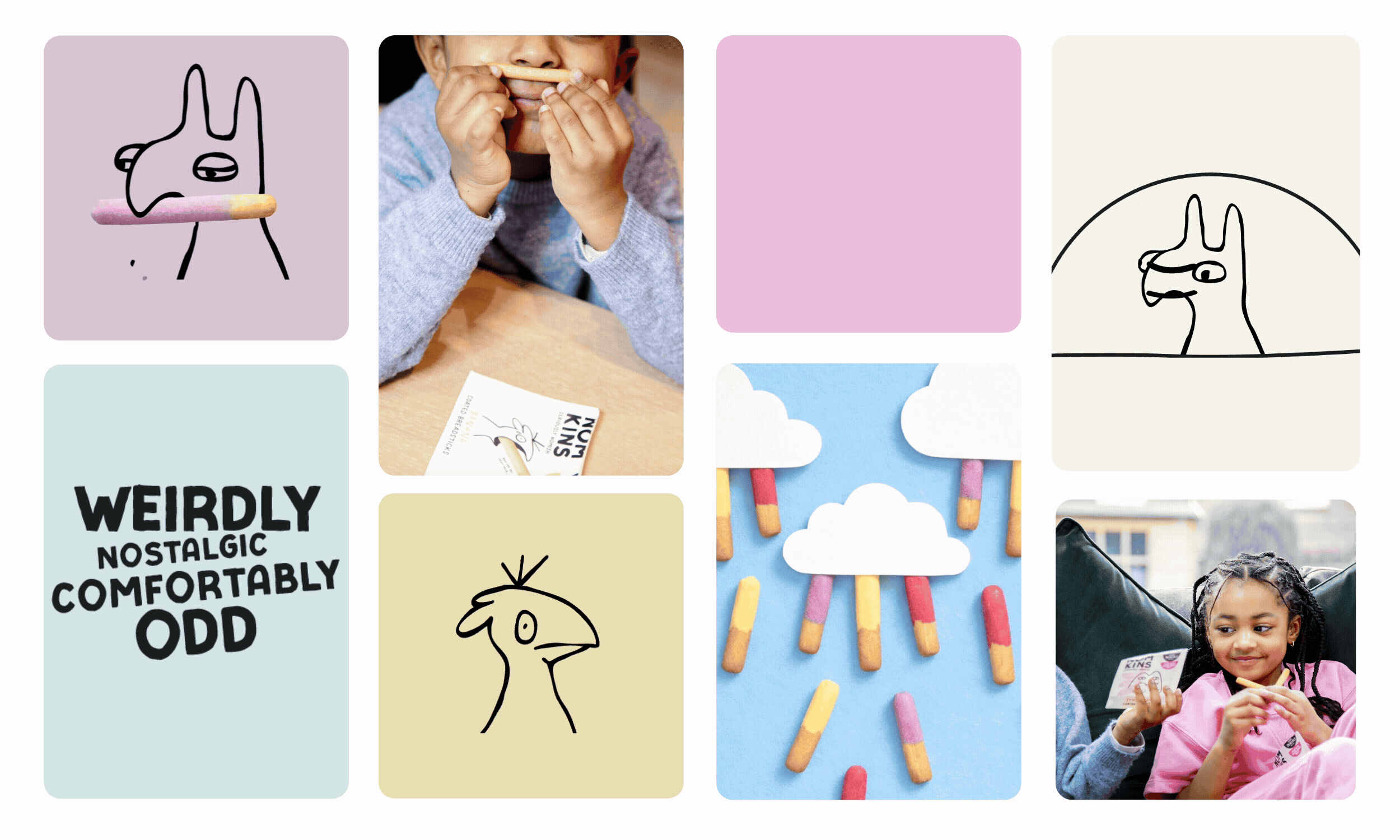
The visual identity was built around the idea of “naturally weird”. Minimal layouts, hand-drawn characters and dry humour created a world that felt distinctive in category, while still approachable enough for everyday family shopping.
would my five year old find this funny?
make it weirder
too far?
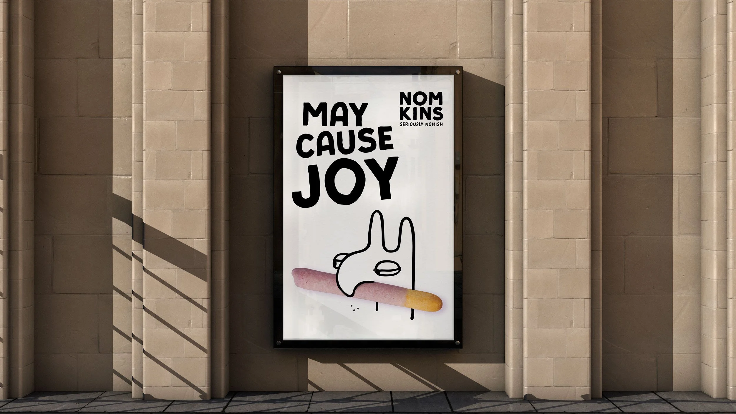
The identity intentionally avoids the visual clichés of children’s snacking. Instead of loud graphics and overstimulation, we created a calmer, more design-led world that trusts the audience to understand the humour.
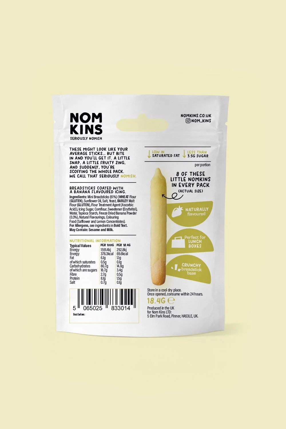
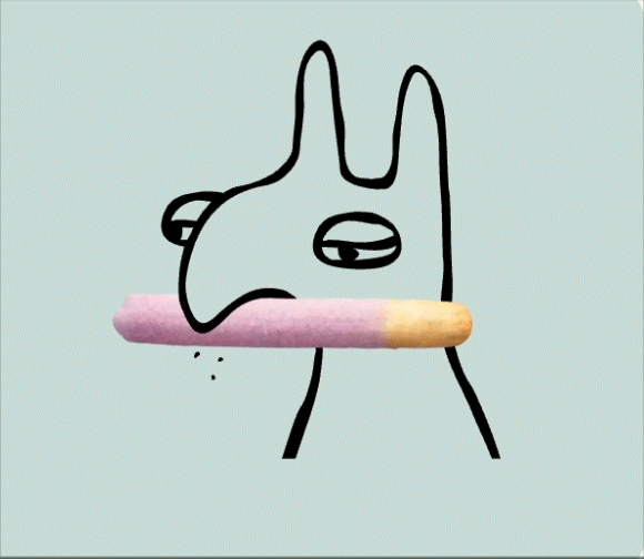
Simple black-and-white illustrations paired with the product itself blur the line between character and snack, helping the breadsticks become part of the storytelling.
Muted flavour colours were introduced sparingly to create appetite appeal and shelf standout without overwhelming the system.
The result feels playful, recognisable and emotionally warm, while still retaining the confidence of a modern challenger brand. A little nostalgic. A little odd. Genuinely playful without relying on chaos. Naturally reassuring without becoming worthy.