A MISSION
TO FILL THE
FIBRE GAP.
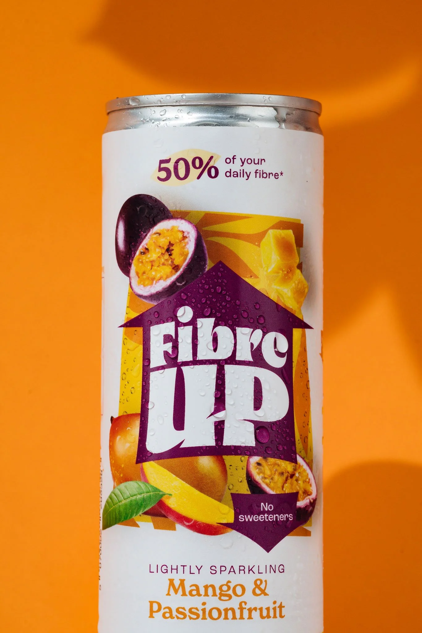
FIBREUP
NAMING, VISUAL IDENTITY, PACKAGING, BRAND WORLD
a quest for better health, nationwide.
When we were approached by Fibre UP, it was clear this was about more than bringing another functional drink to the market. This was about communicating a feeling of doing good for yourself whilst also creating a behavioural change, nationwide.
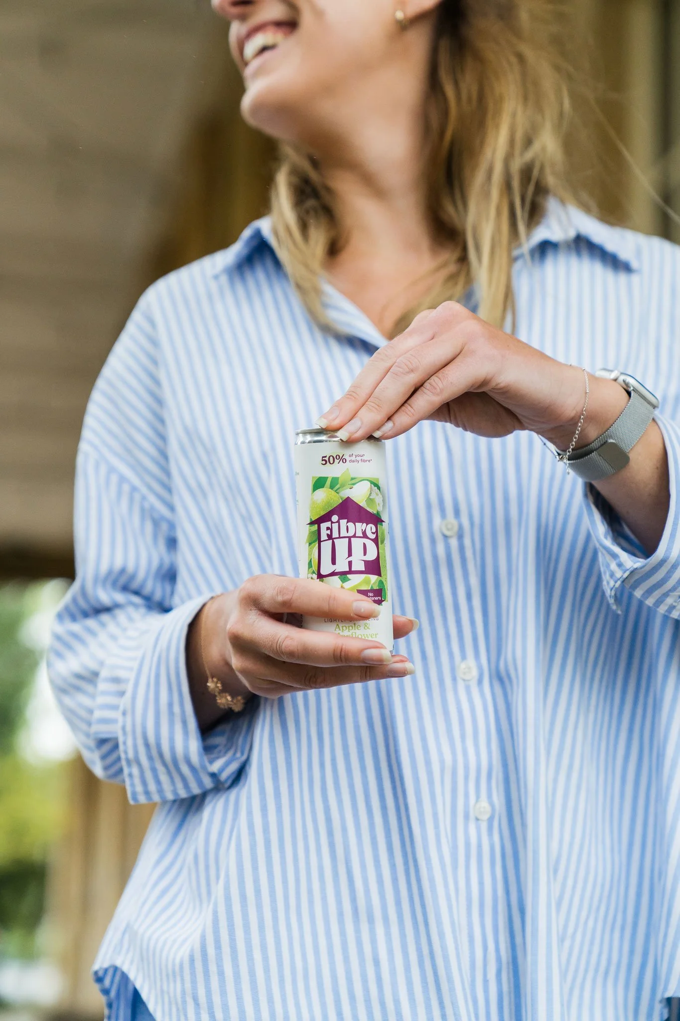
The only way to do this? Create an accessible brand that focuses on clarity of on-pack expression, appetite cues and broad appeal across a wide demographic – the only way of tackling a nationwide fibre crisis.
“We got to thinking… How could we make fibre easy, effortless and most importantly, enjoyable for everyone, every day? And with that, Fibre UP was born.”
THE STRATEGY
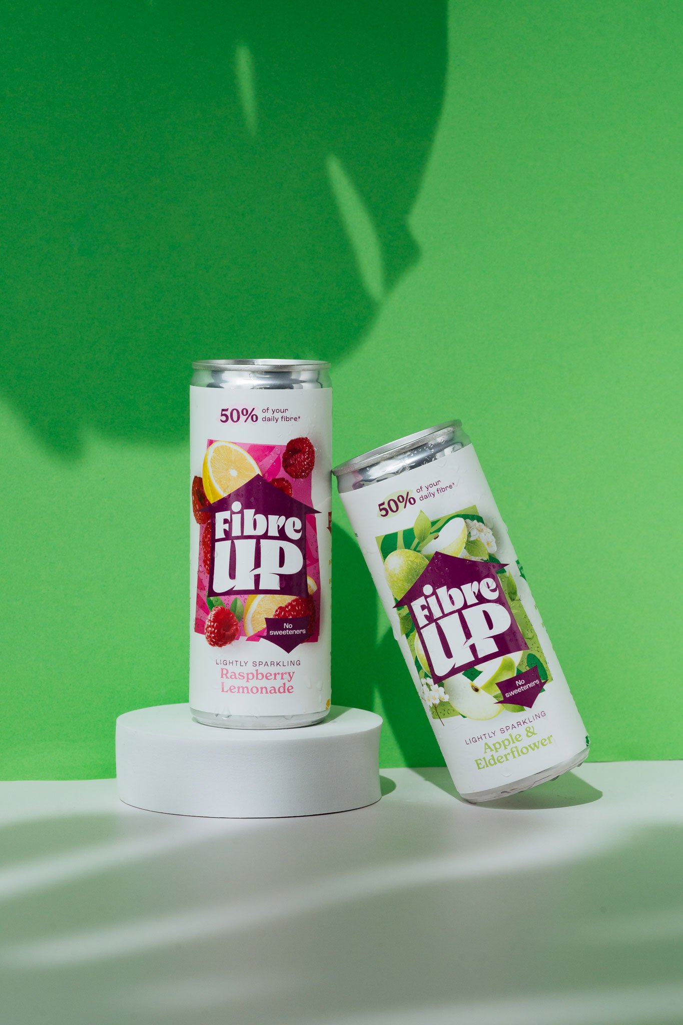
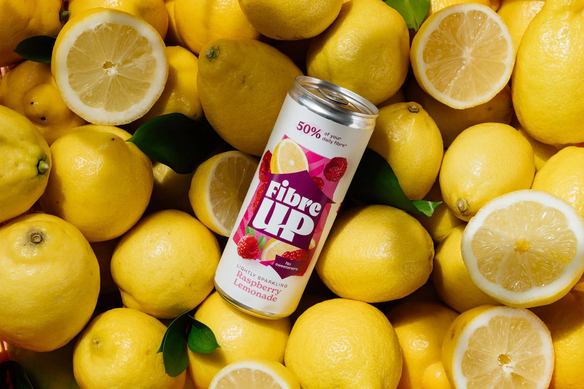
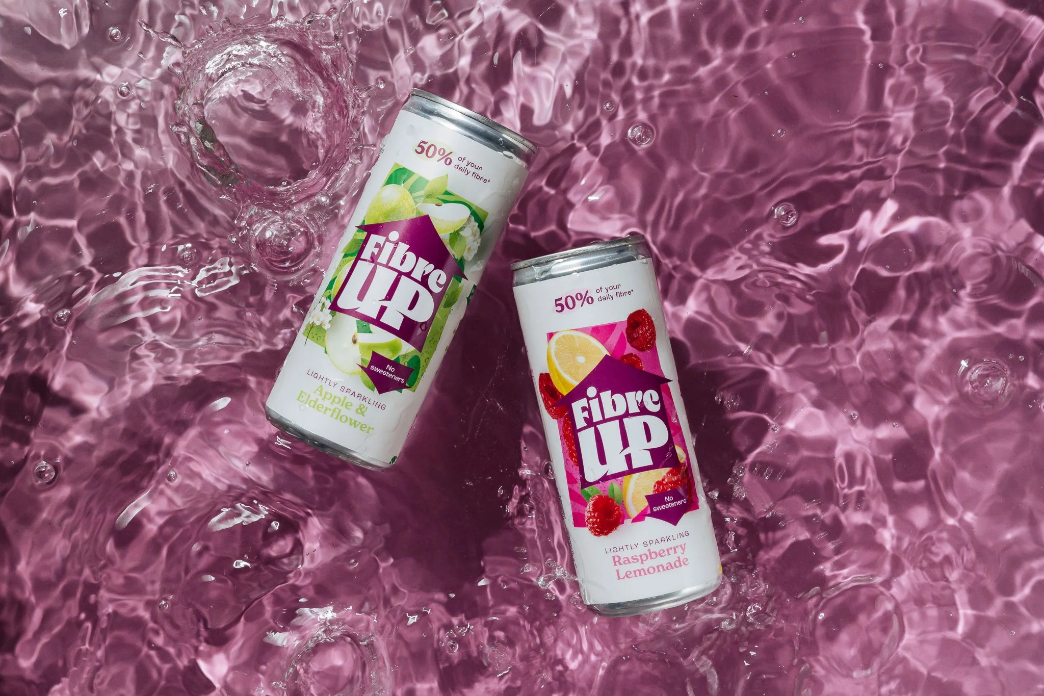
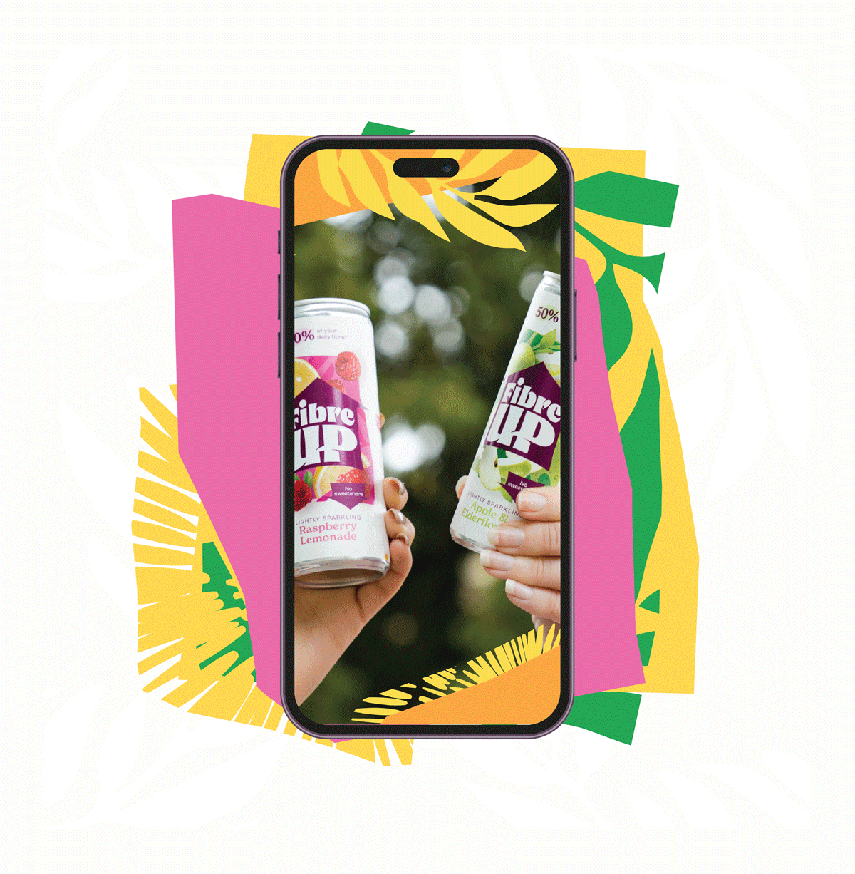
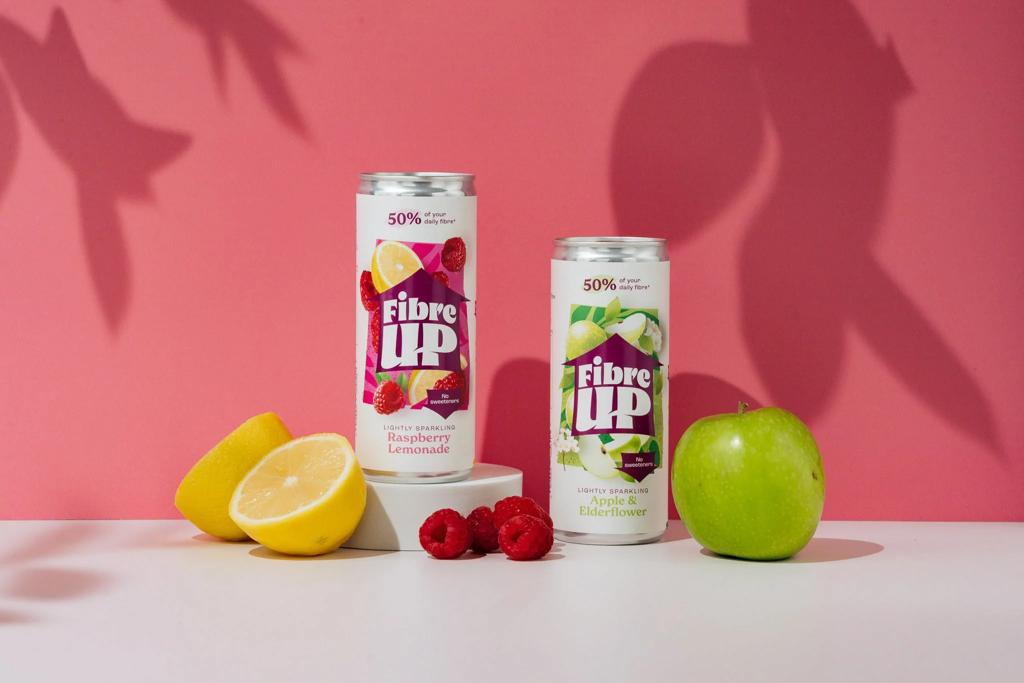
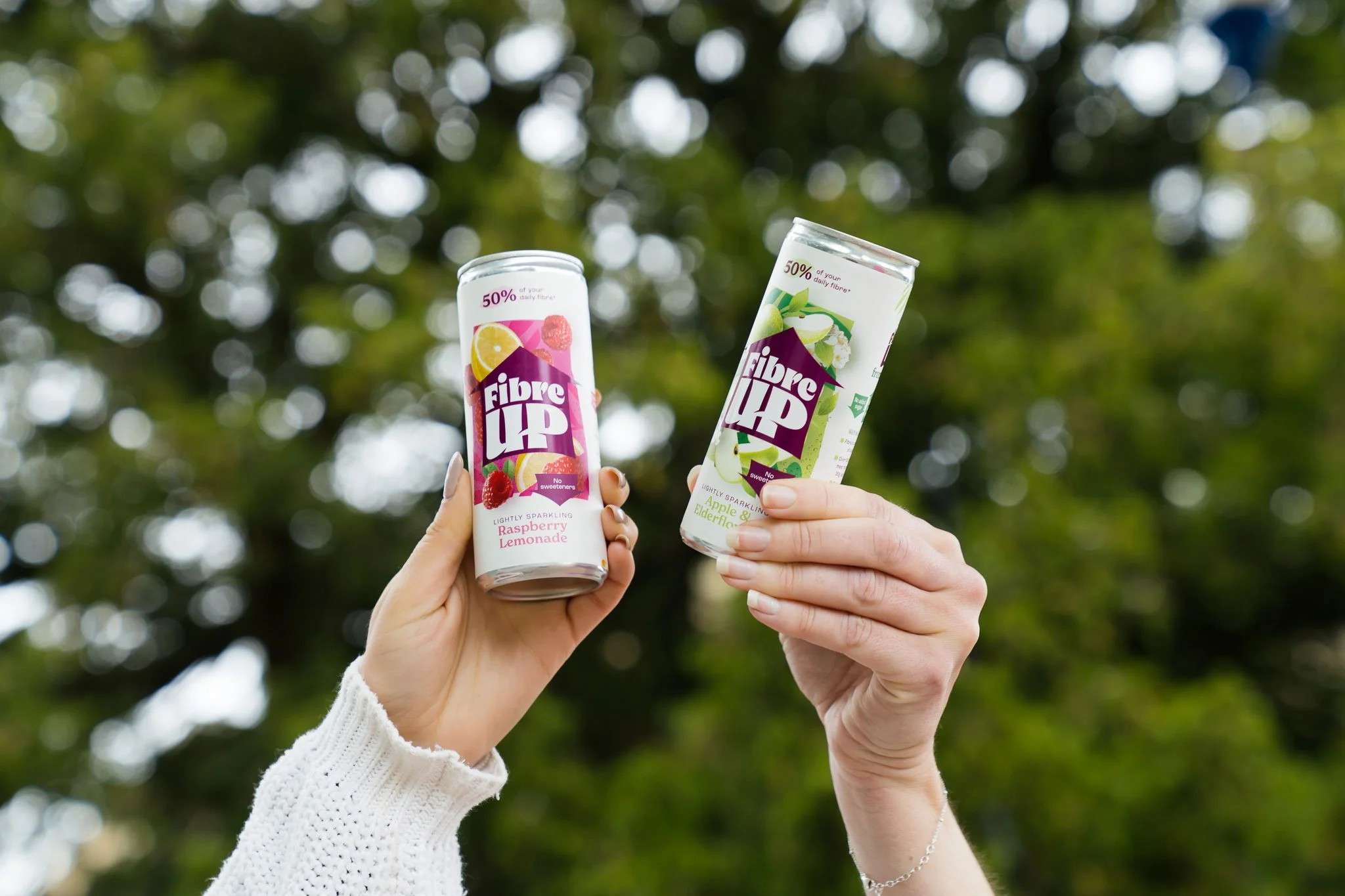
We started with a name that described the behaviour we were trying to tackle…how to up your fibre intake daily. Paired with a clear visual cue, this arrow device became a key way of communicating the product’s core USPs.
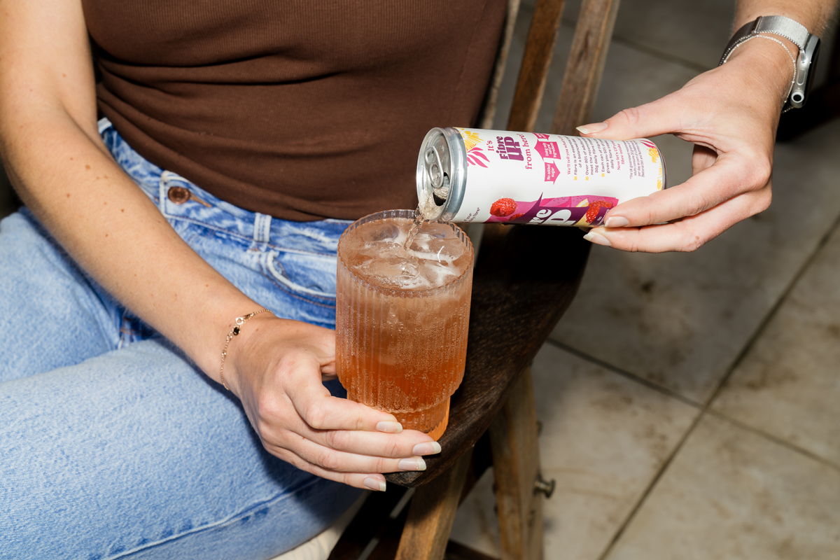
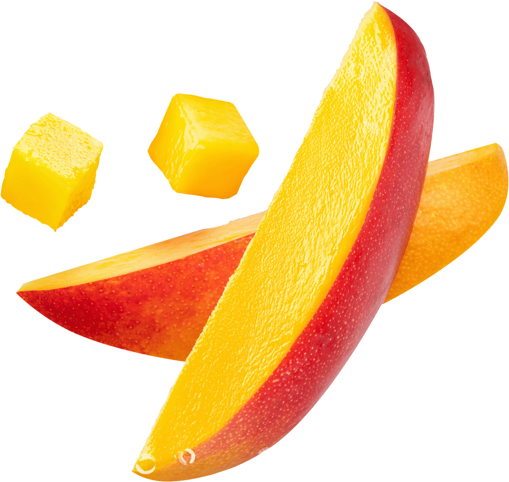
But even with a mission-based brand like this, taste reigns king. So we focused on creating a neutral brand-blocking base punctuated by rich, vibrant and appetising imagery, demonstrating the drink’s genuinely delicious thirst-quenching appeal.
Shelf competition is fierce, so at every stage we questioned “Is this engaging enough for the consumer to pick up” and when they do, “is it clear and obvious what we’re about”. For us, that – and a consistently compelling brand world – is what it’s all about.

Studio photography: Victoria Greensmith.