The Rebranding of Olly's: A Journey to Extraordinary
At BuxtonThreeTwo, we create and build F&B brands that turn heads. We push the unconventional and aren’t exactly conventional ourselves, but those are stories for another time. Insight is our closest and crucial supporting act to the well known protagonist, creative kaboom. Perhaps consider the insight as the GPS / map and the creative execution as a Rolls Royce to get you there.
Today we’re here to talk to you about the rebrand of snack brand Olly’s, a brand that we’ve been working with since their inception. Although the brand has gone from farm stalls to global listings, launching new product ranges, and multiple successful funding rounds, we all felt that there was an opportunity to level up. To take Olly’s to the iconic. To make Olly’s truly extraordinary.
With regards to the wider brand picture, there was a chance to tie the narrative together more succinctly and ensure consistency across the range. With the product, the opportunity was to increase the appetite appeal, and maximise the use of the split second we get on the shelf to get into the hands of eagerly awaiting and ravenous consumers.
Our goals were to create an even stronger, ownable visual cut through that truly reflected our vision, values, aura, and stronger shelf presence. We also wanted to clearly communicate the product offering with on-pack expression that aligned with our price point and engaged new customers. And, we needed to ensure that we had the ability to grow the concept around the brand world and our vision.
So how did we measure this? How do we know if we’ve succeeded? The answer was simple: nothing looks like us! We had no limits, so we had to look like a brand with none and be brave from the word ‘go’ with creative exploration. We approached the project with an open mind, as a blank slate. We didn’t want to be influenced by what others were doing; instead, we focused on ourselves.
The first step in the process was to gather our gold, insight. We did a deep dive into Olly’s brand values, mission, and vision. We wanted to double down on what made Olly’s unique and ensure we could capture that in the brand’s visual identity. It was crucial to lean into the entire Fam-olly and capture the perception and emotion towards the Olly’s brand from everyone in the team. After all, they are the essence of the brand.
We then started to explore the creative world, thinking big, bold, and brave. It was a blank slate. How could we really ruffle things up whilst portraying our message to the market? Insight and testing remained core throughout the process as we developed visuals. We engaged customers to understand how they perceived the identity and also what they valued in the product from a USP perspective, some of which were surprising to all of us.
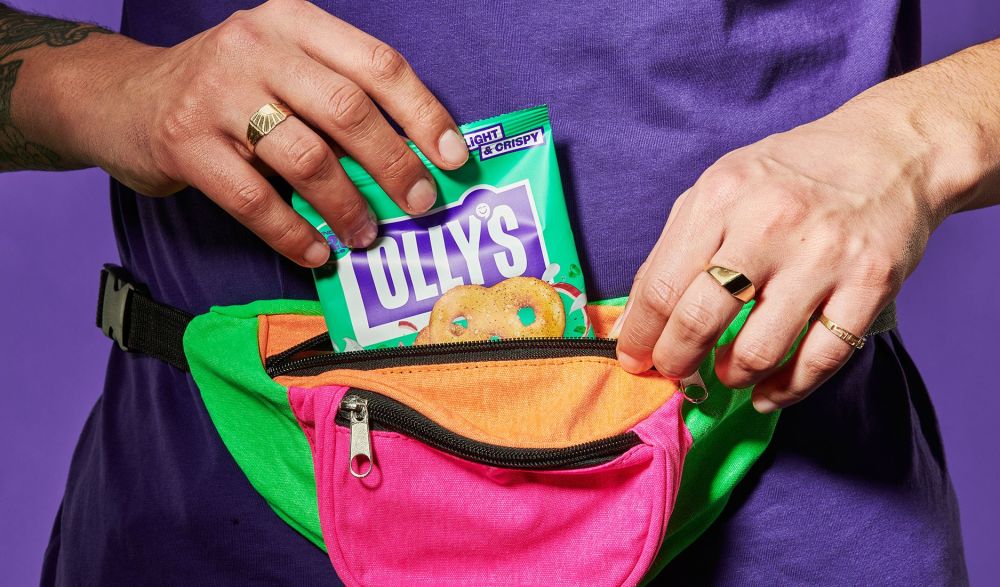
The new visual identity is all about feeding your feel-good. It’s bold, playful and in-your-face snacking that only compliments your day. Hangry pains? Not for us. Shelf-wobbling shelf presence, with a vibrant color palette and design that is etched to turn heads. The on-pack expression is clear and concise, communicating the product offering in a way that aligns with the price point and engages new customers.
Now that the rebrand is alive and breathing, although its infancy still, we have so far hit all the targets. The initial ROS has improved on previous packaging and we have delivered on consistency, cut-through, clear defining of the product offering, and appetite appeal.
The journey to Extraordinary with Olly’s was one that challenged us creatively and allowed us to deliver an outcome that exceeded our goals and objectives. Working with the whole team was an absolute joy as always and without their willingness to be creatively brave, we wouldn’t be here today.
For those of you interested in learning more about the journey, come and listen to Sam and I talk on ‘Docky - The Journey to extraordinary’.

Creative Director